Business Banking Express (BBX)
I built an internal platform for bankers that digitized the manual small business lending application and reduced the process from up to 30 days to 30 minutes.
My role
Product designer
Duration
2019-2020
Platform
Desktop
Team
Product, engineering, business analysts, research, content, legal
Goals and KPIs
Reduce the amount of time it takes to open a lending account from 30 days to under an hour
The old process caused bankers to lose customers to competitors that could fun accounts in the same day.
Make the experience so easy that any banker can use it without special training
Design with future releases in mind
Build components that can scale across credit and deposit products and flows.
Part one
Deliverables
The MVP of BBX (deposit accounts only) was piloted in 2019. The designer left and I was brought on to design the following deliverables for the next release:
Add a small business lending application with four different products
Build flow that allows customers to apply for lending and deposit products at the same time
Add two additional checking accounts to the deposit application
Part two
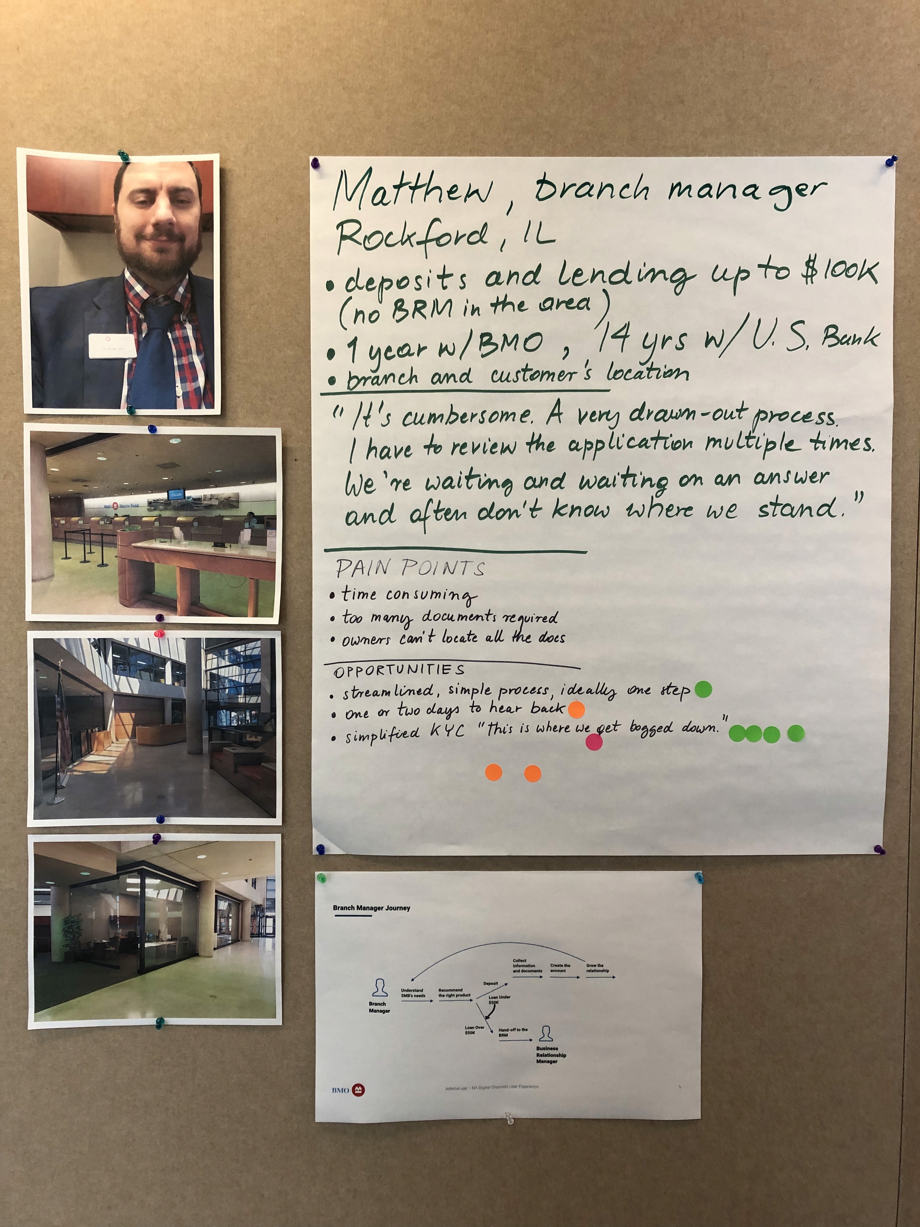
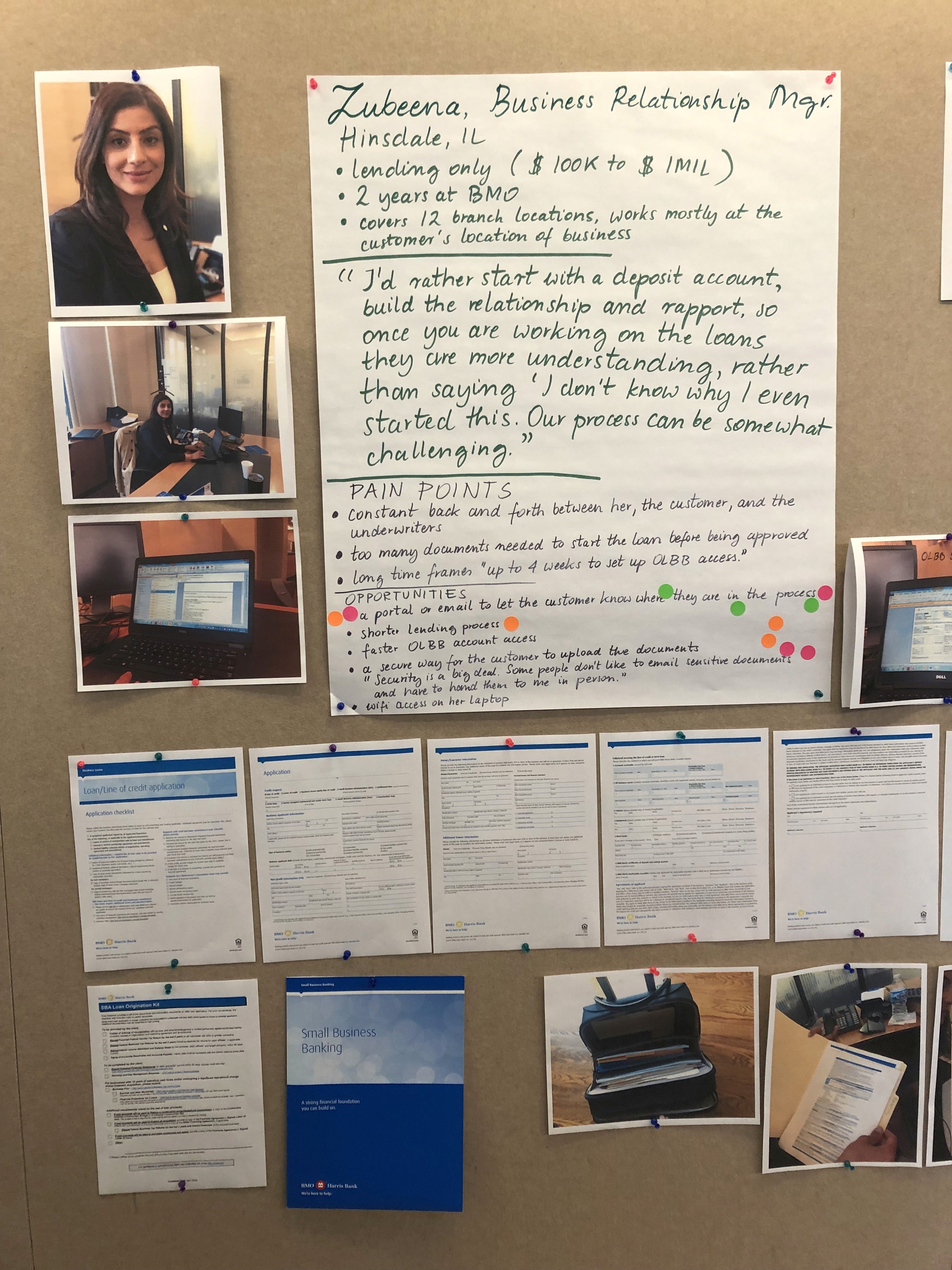
Bankers are the primary users of BBX. My research partner and I met with 13 of them to learn about their experience with the lending process, uncover pain points, and hear what their ideal process looks like. These are some of the insights I took away from our visits.
First insight
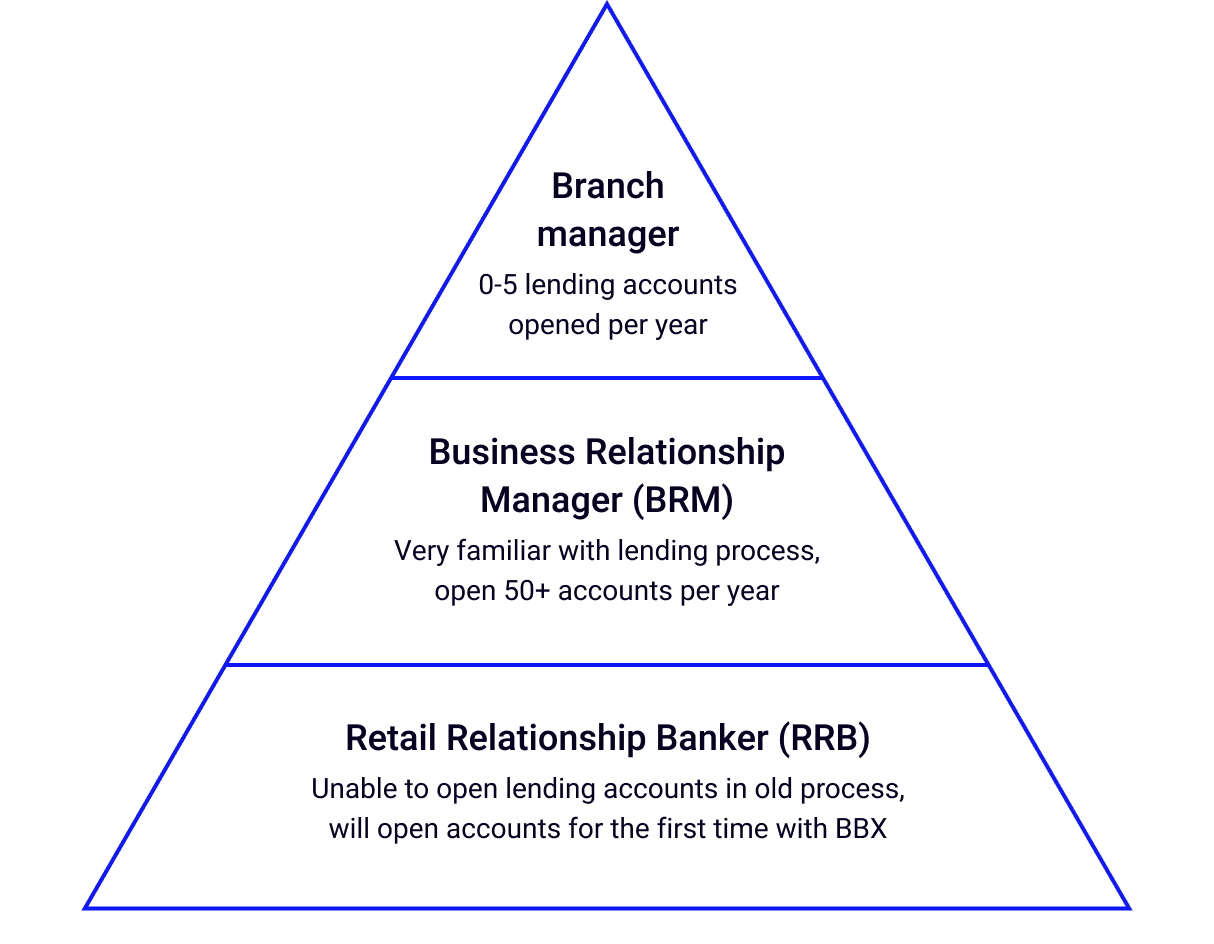
Some bankers were not allowed to open lending accounts with the old process.
Additionally, some bankers who were trained to open lending accounts only opened a few a year.
The application needed to be so intuitive that any banker can use it regardless of how often they open lending accounts.
"In today's economy things are happening in real time. At BMO, things can take so long it's like we are the unofficial FBI. We ask the owners to prove, show, and verify documents multiple times. It creates a sense of distrust."
- Raheem, retail relationship banker
Second insight
Bankers were embarrassed by the length of the process and fearful of making mistakes.
Bankers felt uncomfortable telling customers the amount of documents required and the length of time to receive a decision.
Additionally, because the application was paper-based, one incorrect calculation or wrong number in an address could delay a decision for weeks. This put the bankers on edge.
Third insight
Bankers created workarounds to improve the experience for their customers.
Examples of workarounds:
Pre-filling the paper loan form for the customer as much as possible
Creating an email template that prepares the customer for what docs are needed
An editable Word doc with yellow highlighter showing what fields are required
Writing a detailed description in the submission email that anticipates the underwriter’s questions
Part three
Part four
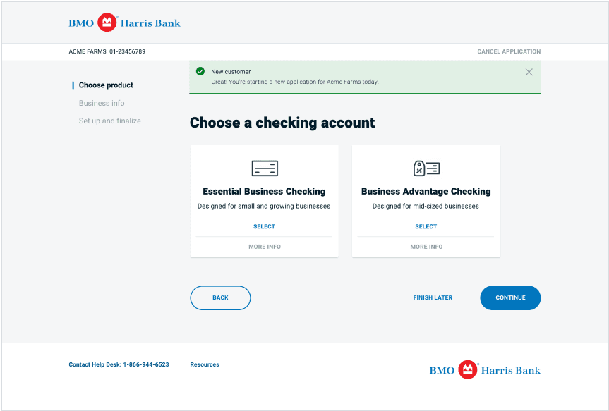
MVP deposit application flow
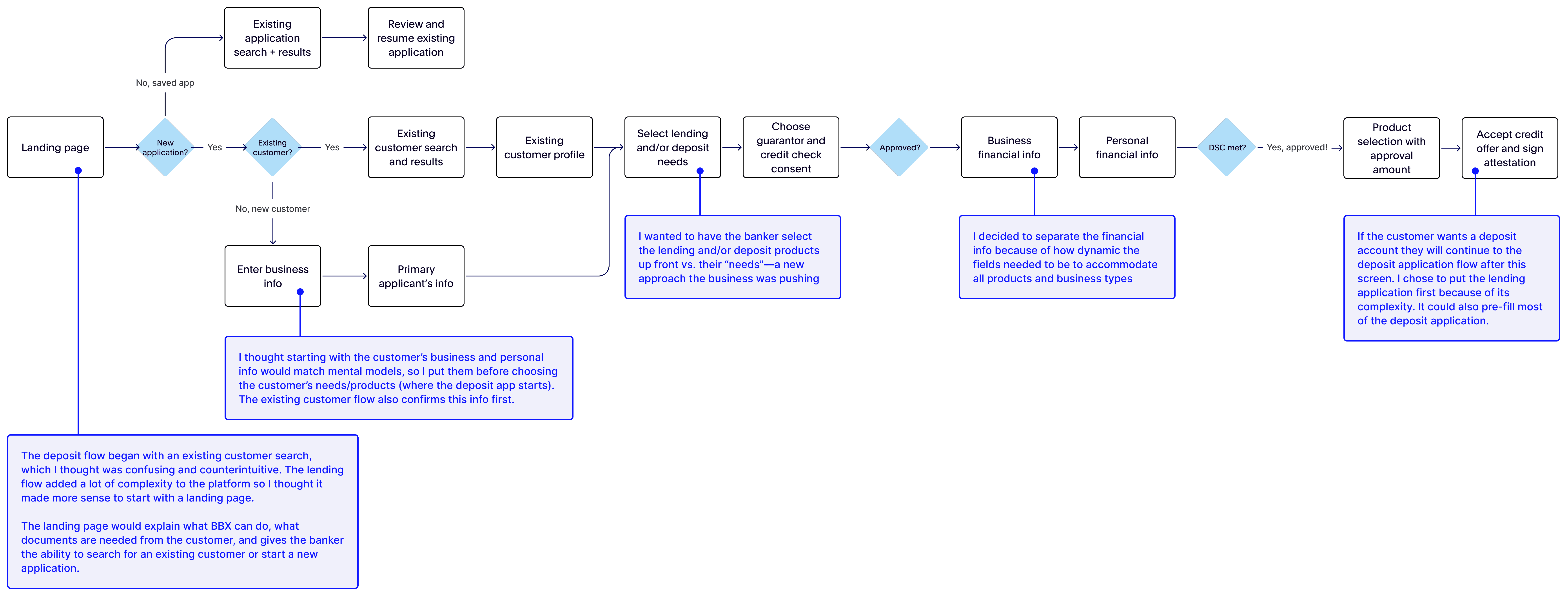
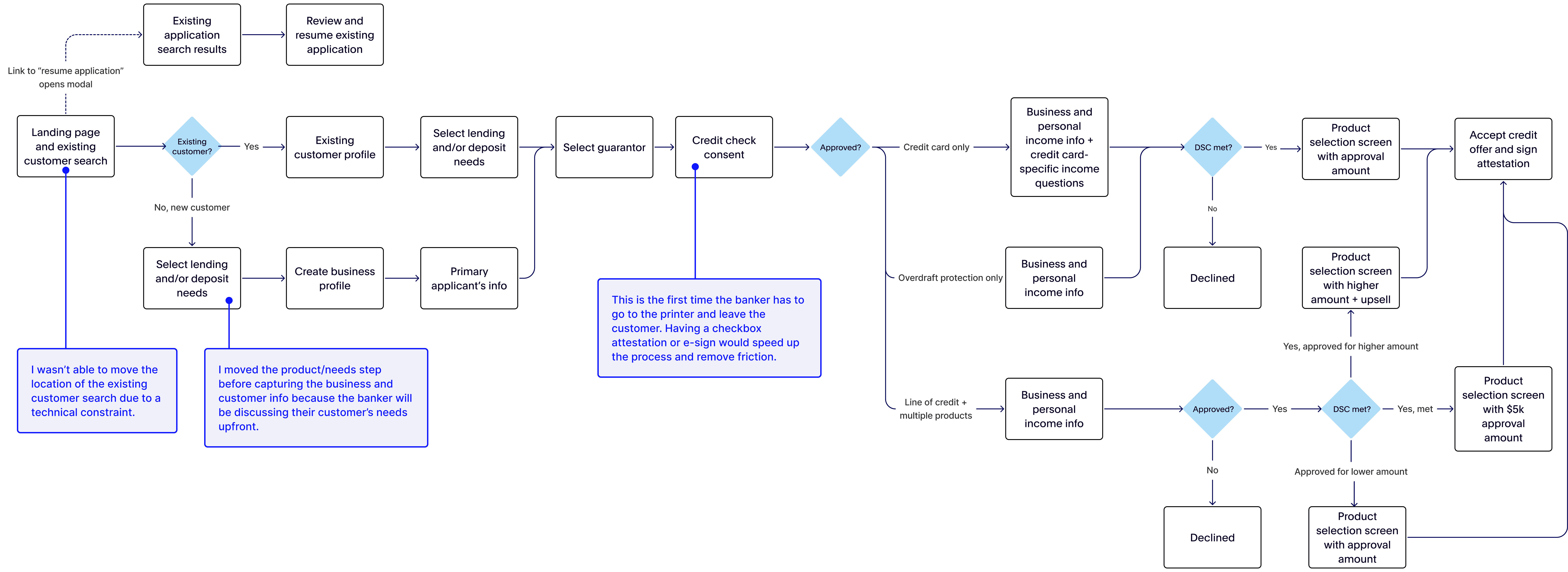
Ideal lending application flow
Updates after review with product and engineering
Part five
I worked with a UX researcher to get bankers' feedback on the IA, flow, and content. The tests were done in-person.
Key takeaways
Lead with lending
Customers usually don't want a deposit account if they're declined for a loan. Bankers would typically do the lending application first.
Bankers didn't understand the "needs" based approach
E-Sign would save time and money
Adding this capability would eliminate a lot of friction and allow customers to sign documents ahead of time or virtually.
The flow matched mental models
Bankers said the flow was similar to the paper application, which is what they referenced as they completed the prototype.
Part six
Selecting the customer's needs
The biggest challenge was making sure the lending choices were clear to bankers. Product was adamant about this needs-based approach to lending vs. choosing products up front.
Bankers didn't understand this idea because they didn't customers they were relying on a computer to choose products for them when they (banker and the customer) know what they need.
While my content partner and I weren't able to remove the needs-based approach, we were able to add descriptions to make each lending need more clear.
Choosing the guarantor
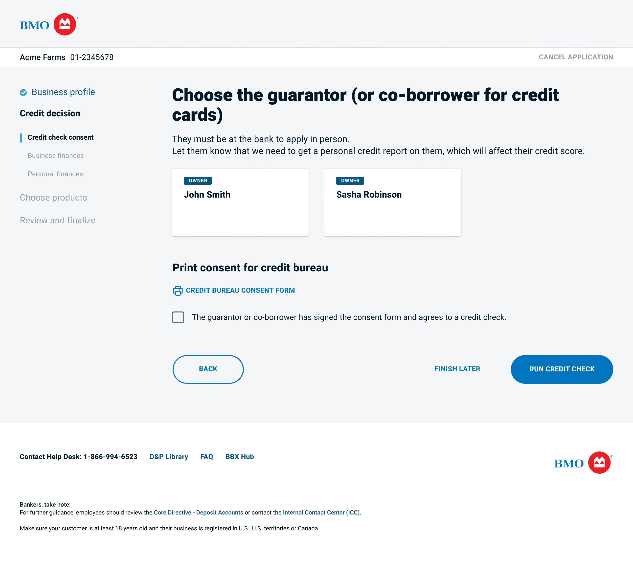
The next step in the lending process is to choose person who is financially responsible for the loan.
This is the first time in the flow the banker must leave the customer to print a document. I pushed back on printing a form to consent to a credit check—I felt strongly that the checkbox as an attestation would cover any bases from a legal/risk perspective.
Collecting financial information
I made the page dynamic based on the type of tax return forms the customer has. Once the form has been selected, the corresponding line numbers appear to help bankers collect the right information.
Building a scalable product selection solution
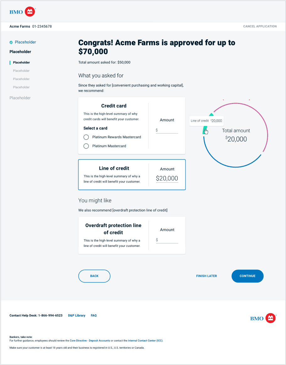
This was one of the most challenging screens to design because the page had to communicate the amount their client is approved for and the product(s) they're approved for. The components needed to scale across products and for future releases.
Version 1
Using cards to contain each product work well for all offer scenarios
I spent a lot of time determining how to display the total amount remaining. I thought a circle worked better than a slider or scale.
Selected state needed to be more noticeable
The circle felt too thin and incomplete
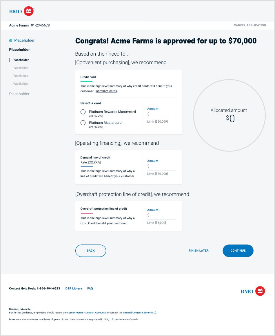
Version 2
Added the color associated with each product to the card
Final
Made the selected state more noticeable with the checkbox
Removed the content above each card to reduce noise
What action changes the card from unselected to selected? Does clicking anywhere on the card "select" it? Is it unselected until an amount is entered? Once I consider error handling it became clear that the product should stay unselected until an amount (or credit card selection) has been entered.
Looking back, I wouldn't change the credit card container to selected until both required actions were taken.
Adding additional products to the deposit application
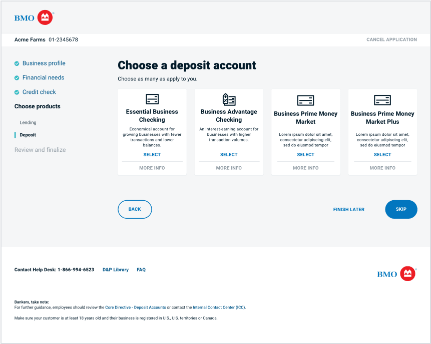
Two Money Market products were added to the deposit account section page, but it required some reworking of the original layout to get there.
MVP
Idea 1
I tried using the existing component and determined it wouldn't work with more than three products in the same row. The icons weren't very specific or distinguishable either.
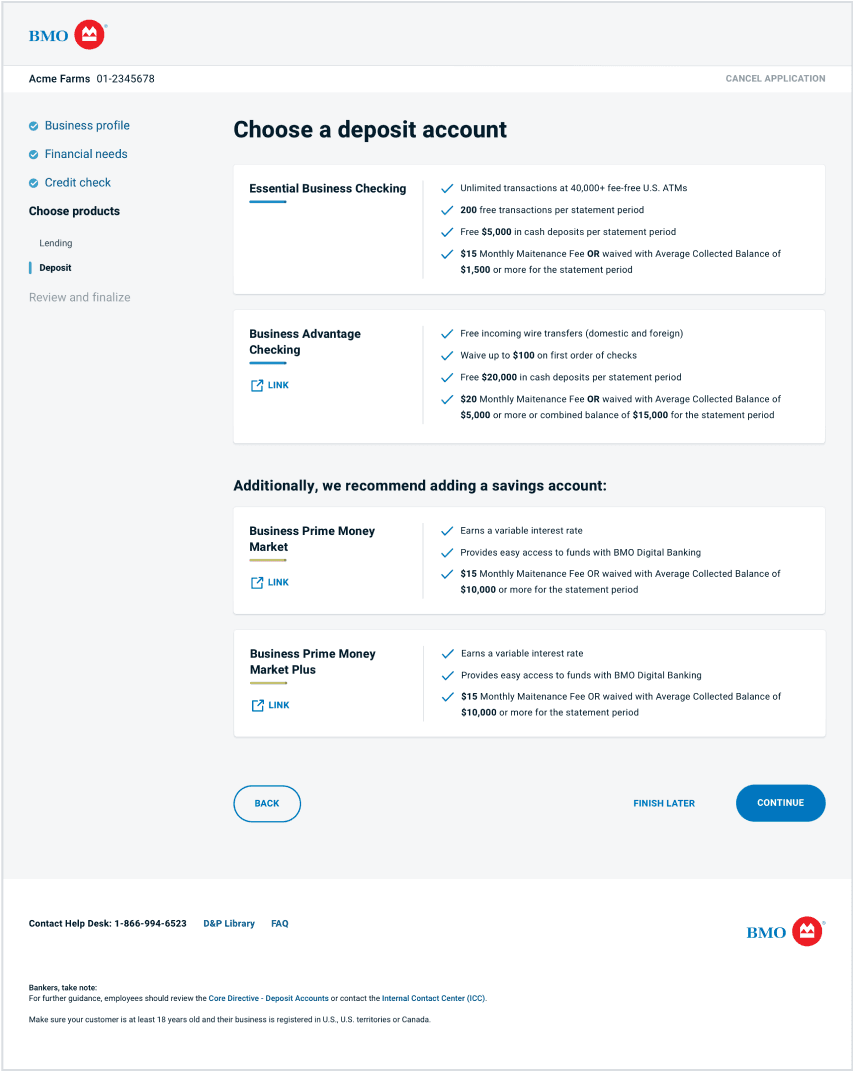
Idea 2
I wanted the deposit product cards to look similar to lending's cards for consistency.
I expanded the width of the cards to fill the entire container so the value props are easy to scan. However, having all of the content in view felt overwhelming so I kept iterating.
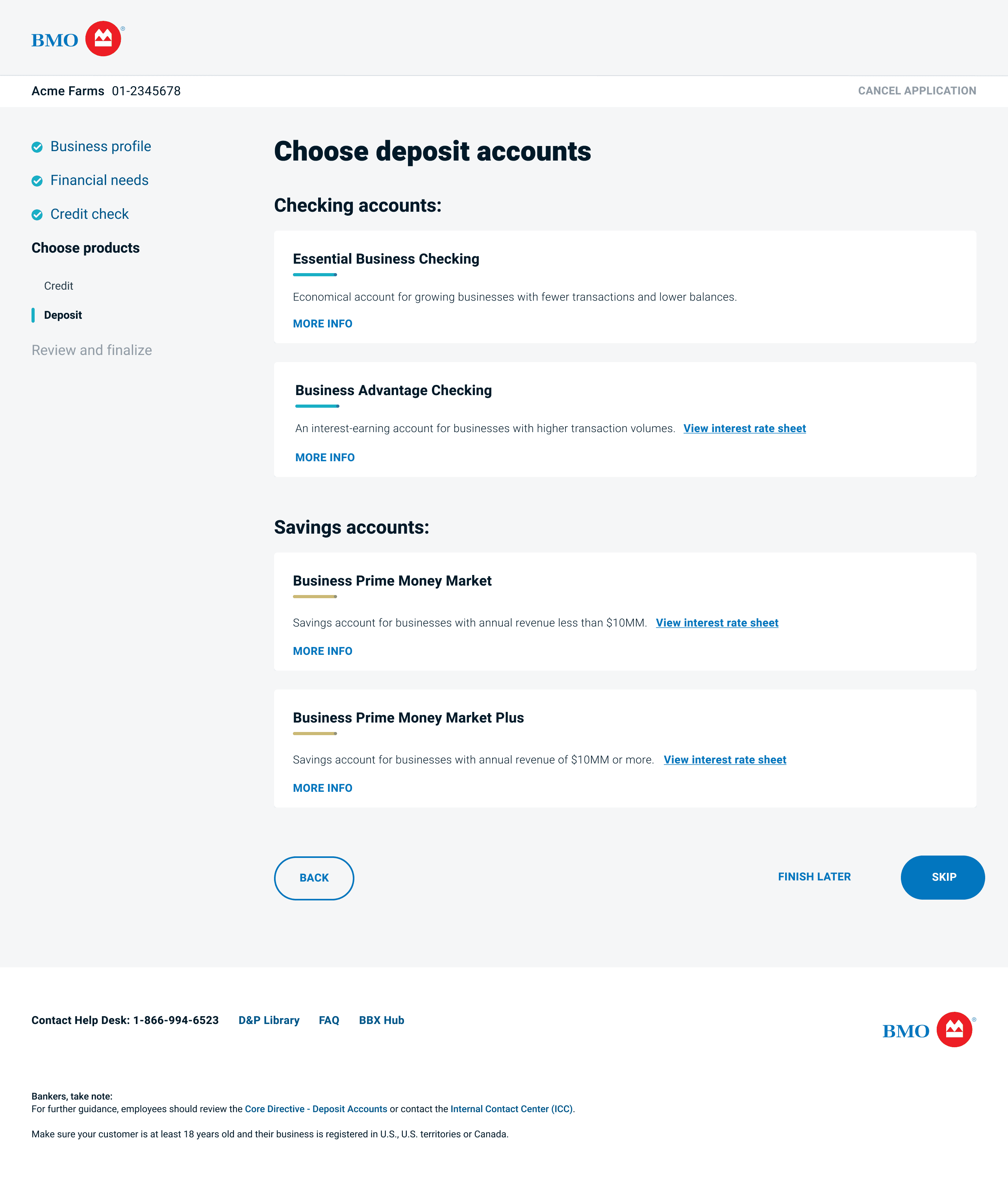
Final
I worked with my content designer to come up with an overview of each product and hid the rest of the value props behind the "more info" button that expands the card like an accordion when clicked. I thought this struck a good balance of sharing enough info without being overwhelming.
The banker can click anywhere on the card to select the product.
Part seven
Part eight
BBX launched in all US branches in January 2020 and reduced the amount of time to apply for a loan from up to 30 days to 30 minutes. The platform has saved bankers thousands of hours of time and helped BMO attract and retain small business customers with the new ability to provide an instant credit decision.
Technical limitations were the biggest challenge.
The experience could be simplified further if BMO invested in e-sign technology, better databases for storing existing customer info, and fewer platforms for things like ordering debit cards, checks, etc.
Adding e-sign would save a significant amount of time by eliminating the three to four trips to the printer. It would also enable bankers to use the application outside of branches as long as wifi is available.
I also would've liked to add the ability to start a new application to the BBX landing page so bankers could skip the existing customer search if they're working with a new customer.
