PayPal Cashback Mastercard Acquisition
I designed, launched, and optimized the acquisition experience for PayPal’s most rewarding card ever.
My role
UX designer
Duration
2021-2024
Platform
Web
Team
Product, engineering, research, content, marketing, legal
Goals and KPIs
Design a seamless and engaging experience for our customers
Build components and flows that can scale across experiences
Increase funnel and conversion rates vs 2% credit card
Acquire one million new customers in the first year
Part one
Discovery
Researched our target customers
👤
Existing customers who are 30+ years old
💳
Have used PayPal Credit or BNPL products responsibly
🏷
Price conscious and mindful of credit score
✅
Value simplicity and transparency
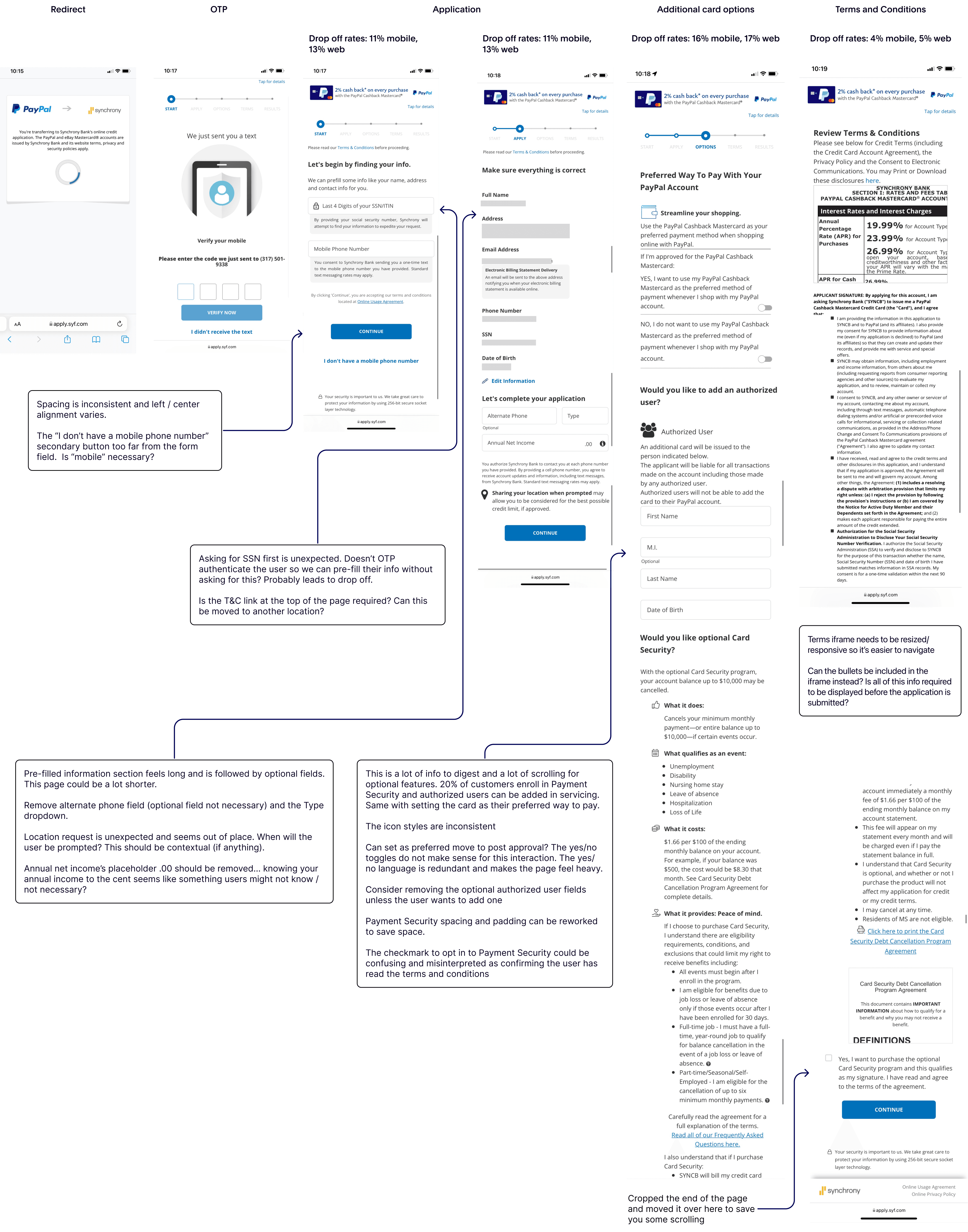
Reviewed existing analytics and completed a UX audit
I dug into historical data on the existing PayPal Mastercard application to understand user pain points and barriers to conversion. I also did a UX audit of all existing PayPal applications.
What I learned
The highest drop-off occurred one page before applying
Payment Security (optional feature) added a lot of friction
Application felt outdated
The order of questions didn’t make sense
Lack of consistent UI patterns and elements, creates distrust
Conducted moderated usability testing
I worked with a UX researcher to test the flow with eight existing customers. Our goal was to uncover pain points and any barriers to conversion.
Research takeaways
Customers had too many questions about qualifying events and cancelation to enroll in Payment Security at that time
More than half of participants were not sure how to opt out of Payment Security
Some thought the application had more legal info than other banks
Part two
How might we…
Design a seamless acquisition experience that encourages existing customers to apply and earn 3% back on purchases they're already making?
Part three
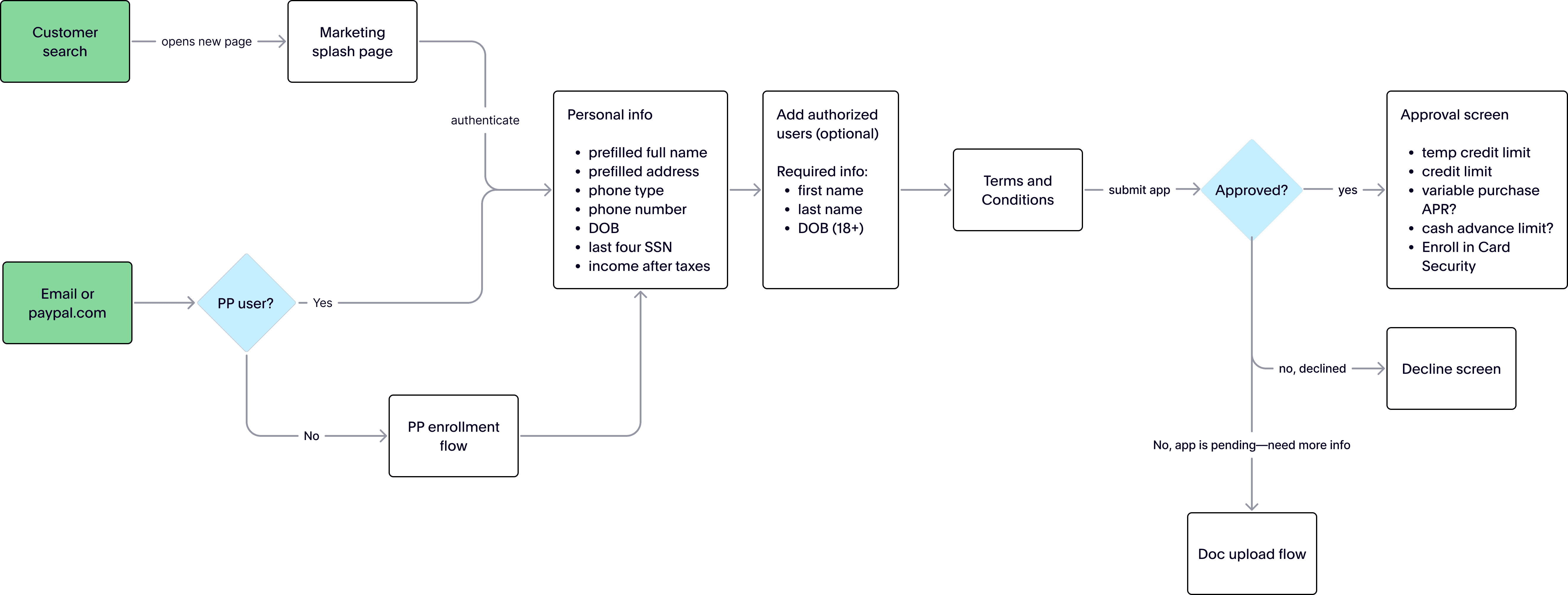
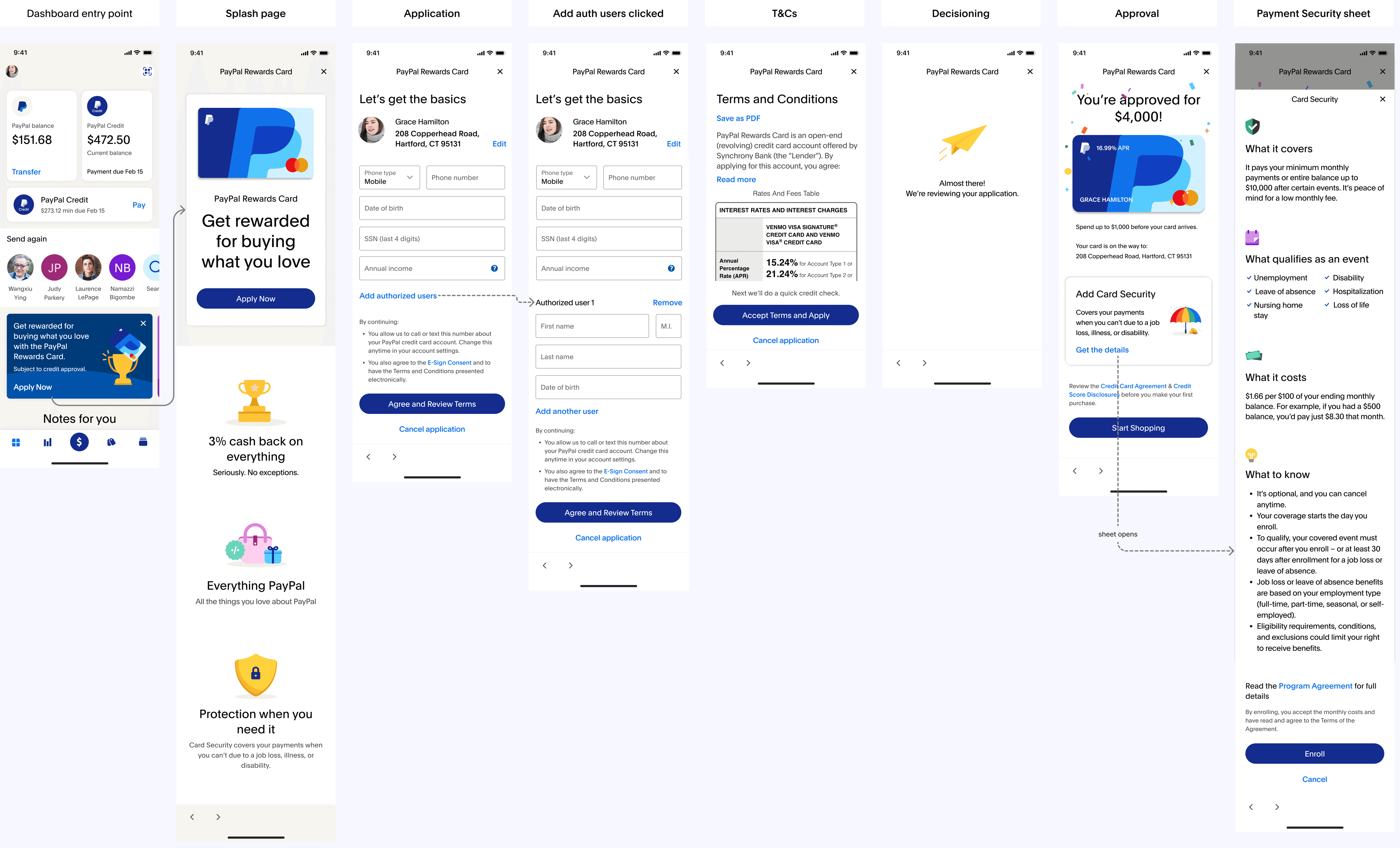
Building the happy path
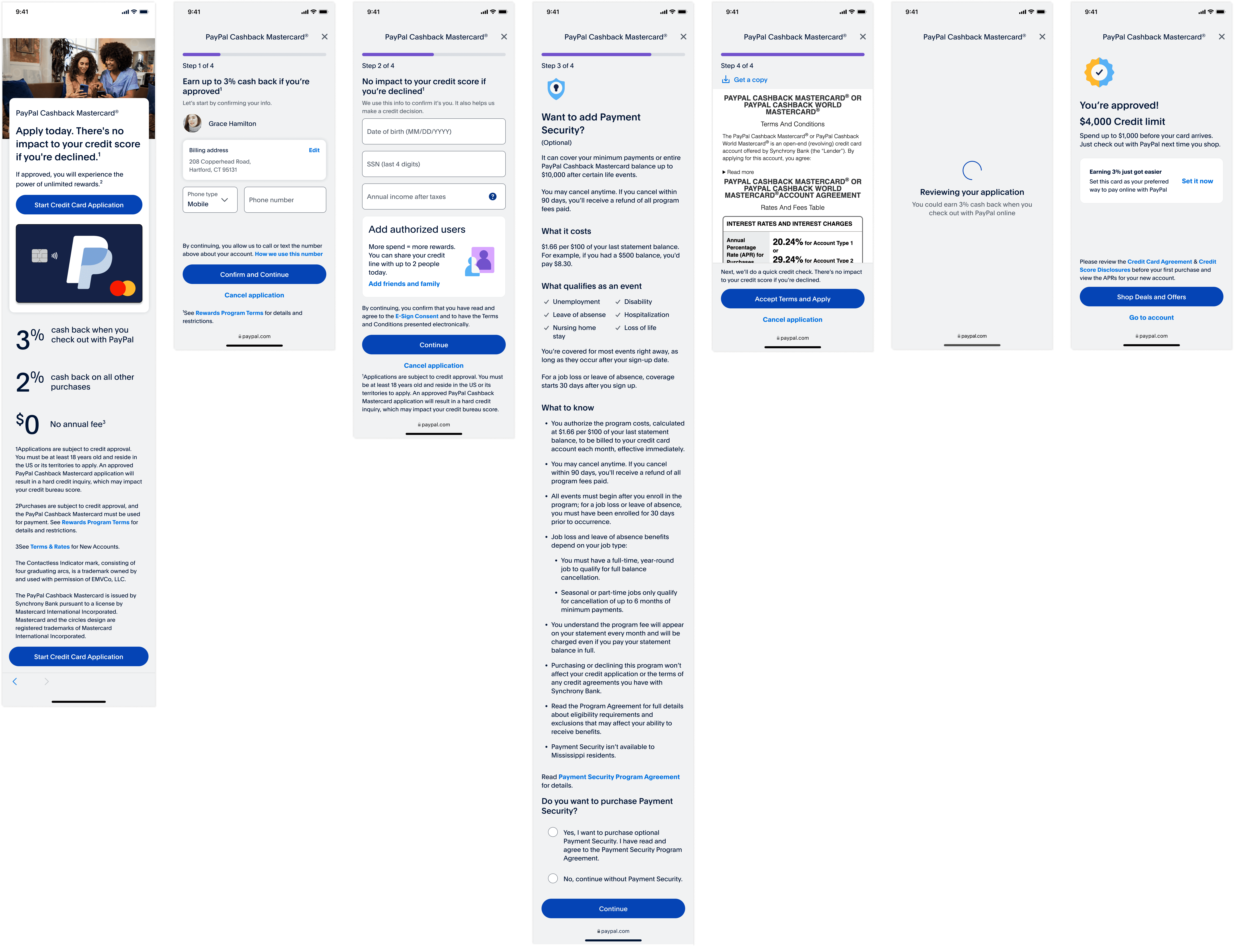
My goal was to provide the customer with the info they need to quickly apply for the card.
Part four
Design explorations
First flow I shared with stakeholders
I drew inspiration from experiences within PayPal, marketing landing pages, and acquisition flows outside of fintech. In hindsight wish I spent more time exploring bolder ideas for the splash page, but I was very new to PayPal and unsure of what was/wasn't off limits.
Form field ideation
Determining the background color
This was the color recommended by the design systems team, but it didn't work well with the legal text and contrast vs. some components. I advocated for a white background.
Banners felt unnecessary
I explored some concepts with a banner at the top, but the content made the page feel heavy.
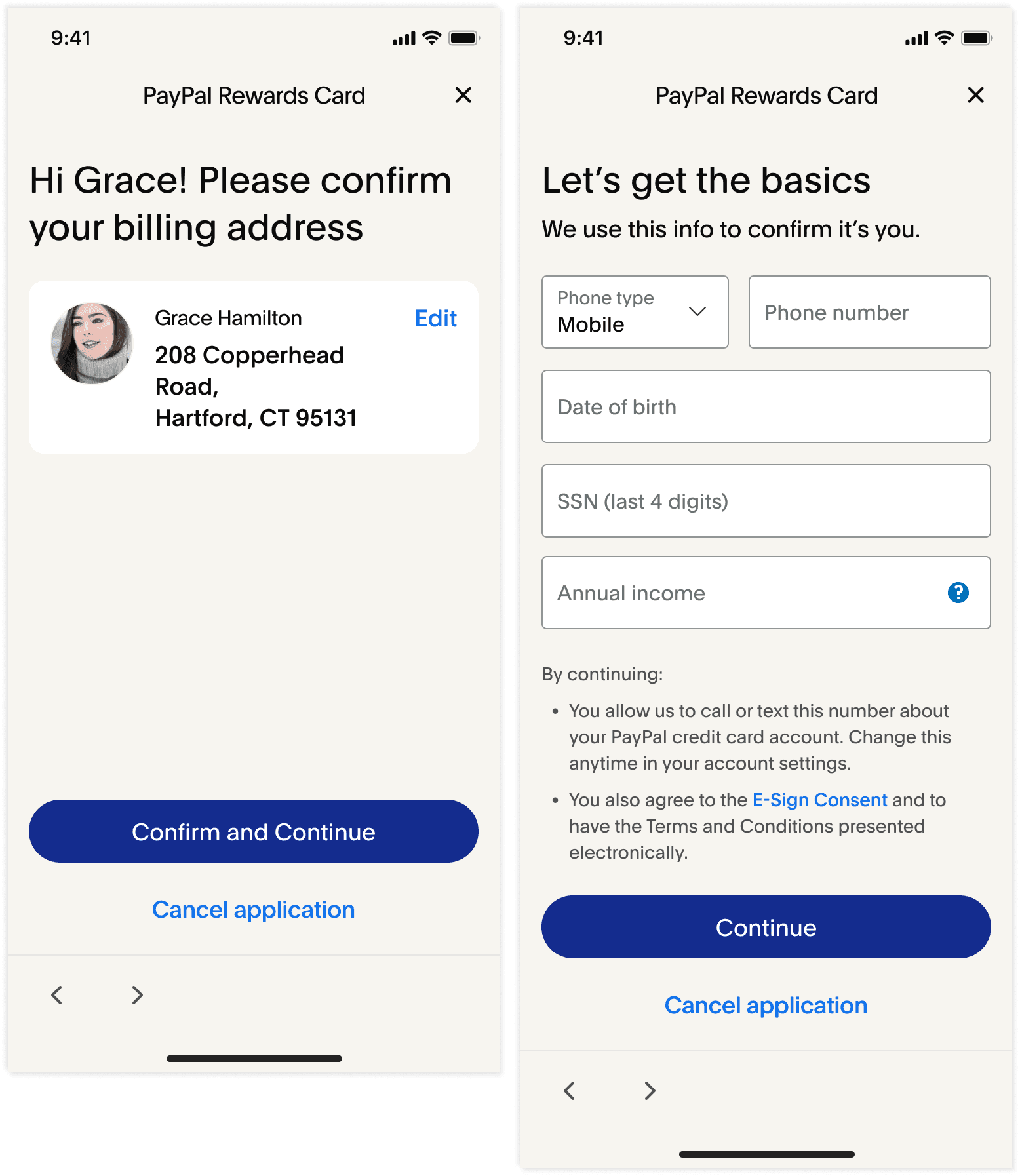
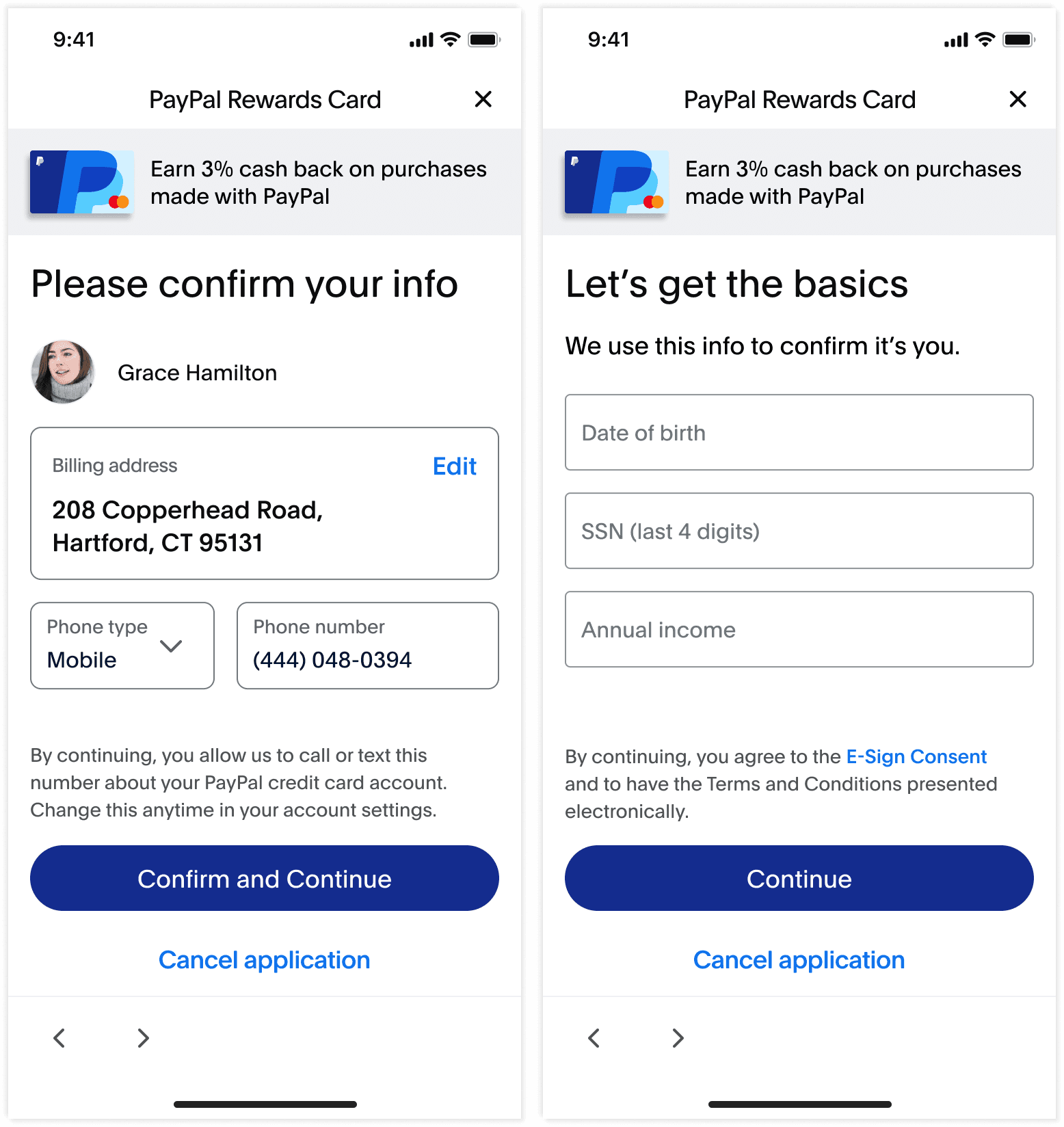
I liked having one page for pre-filled info and the other for the info we need to collect. PayPal's Pay in 4 application is structured this way as well.
Trying something new
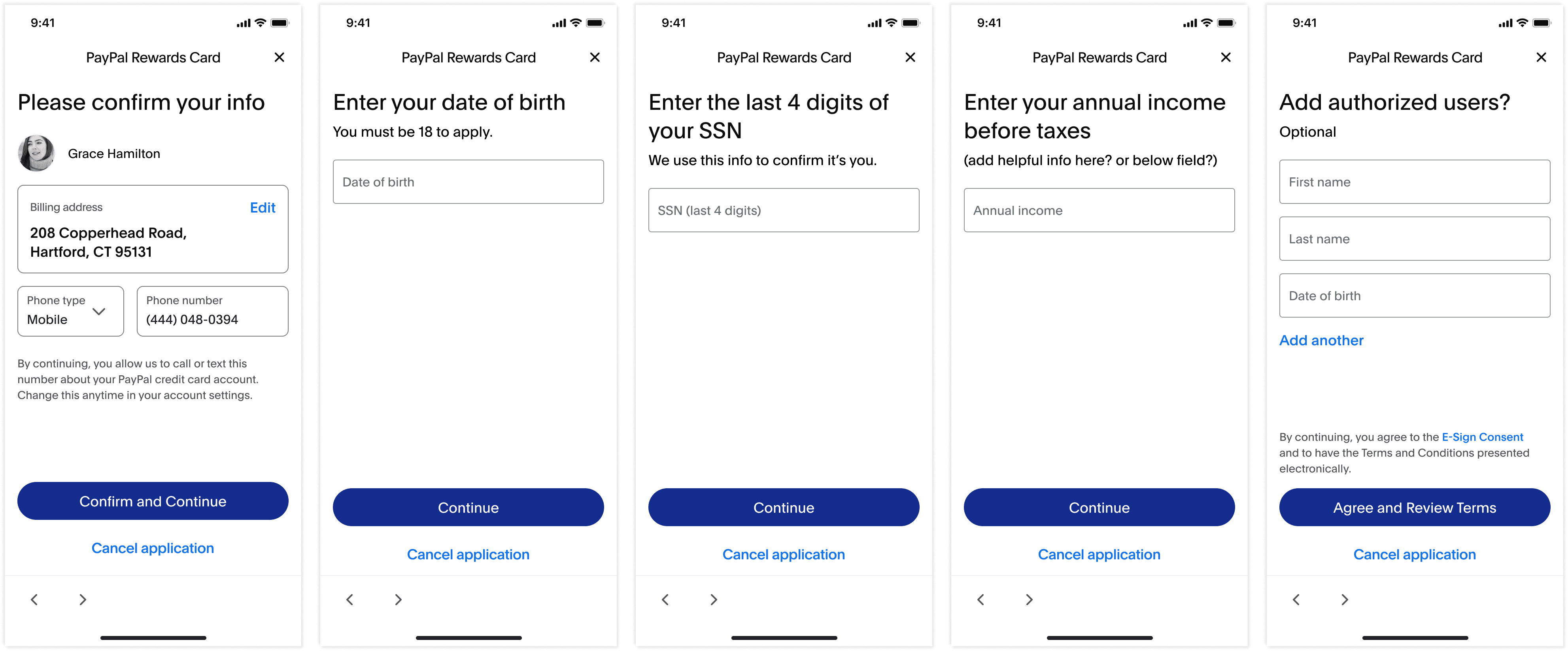
I was inspired by Apple Card's one question per page application and thought this approach would work well with our customers. Unfortunately I wasn't able to move this idea forward because no other PayPal acquisition flow was structured this way.
Technical limitations change the flow
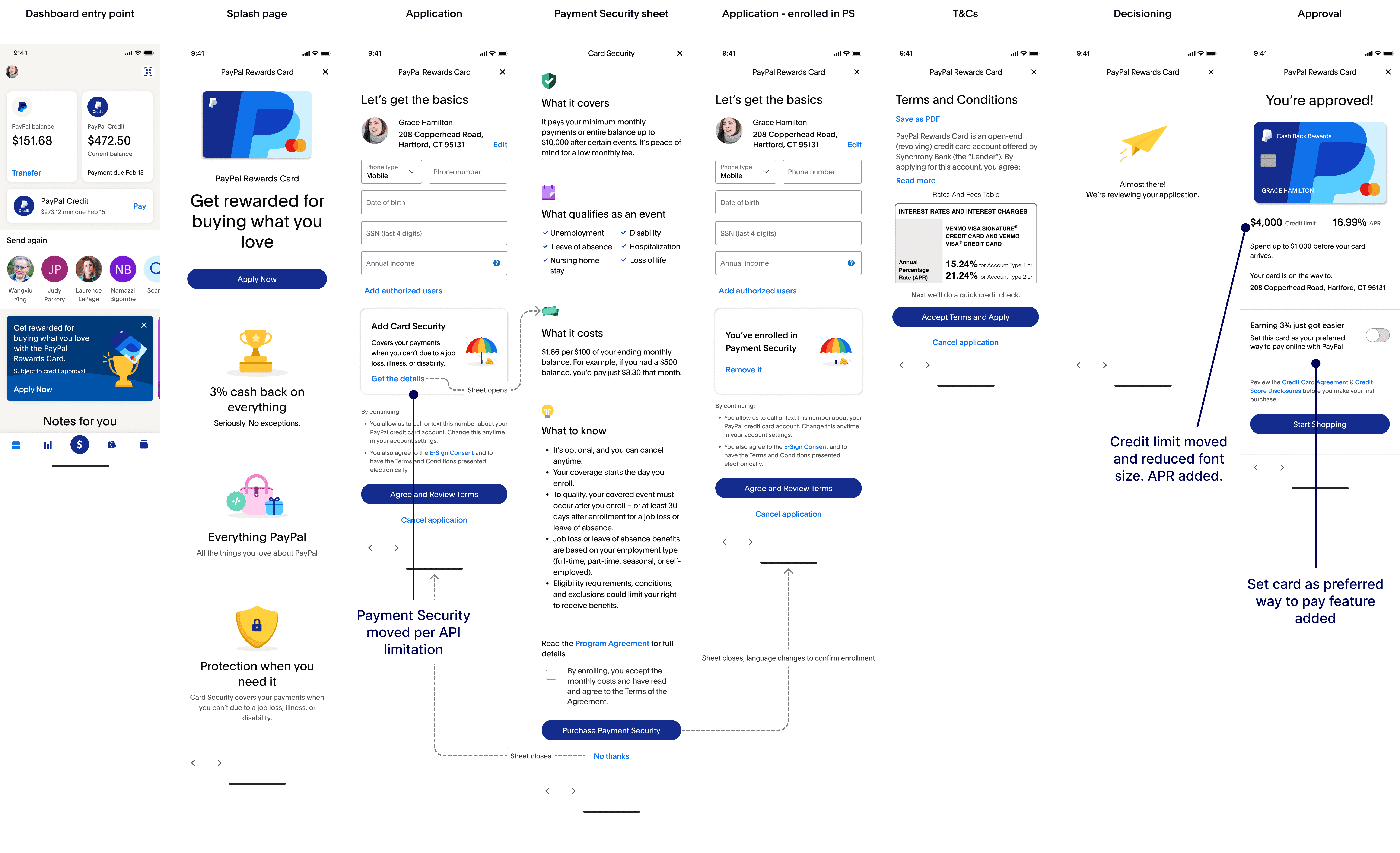
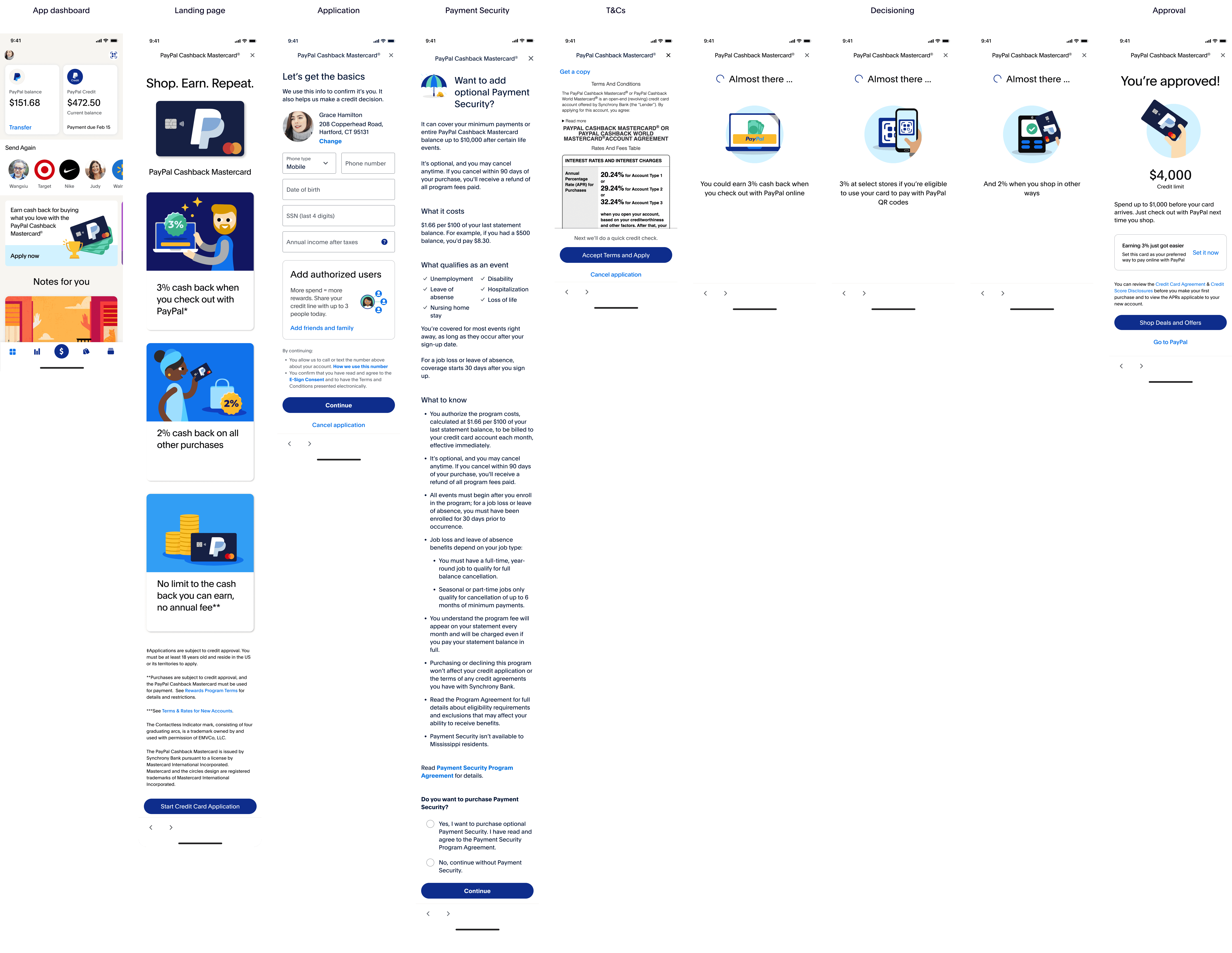
This is the second version of the flow that I shared with my 3iab team.
Payment Security moved because the API call takes place before the customer submits their application. It would take months for SYF to move the API and would delay the launch.
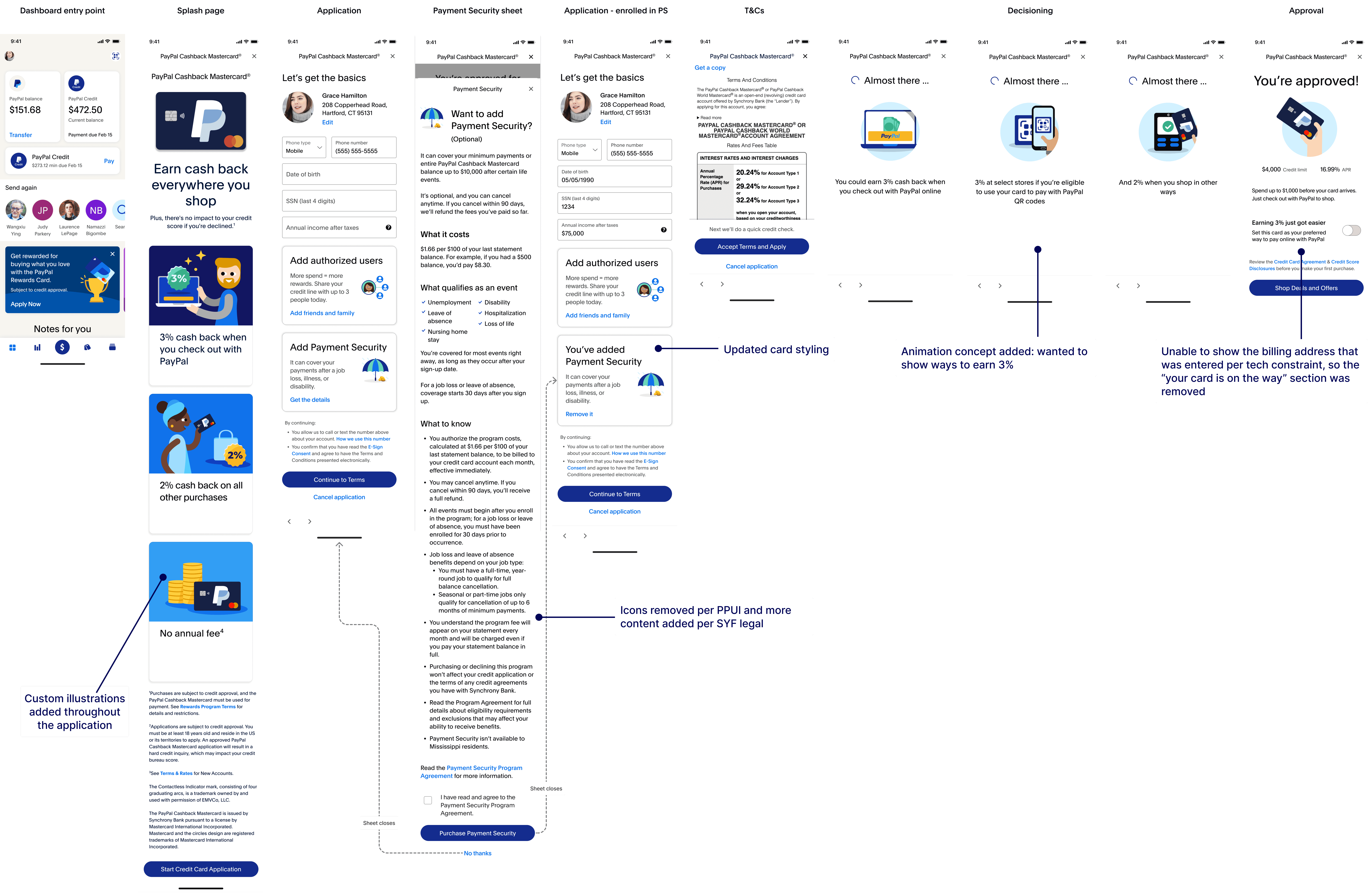
Custom illustrations added
This is the third iteration of the flow I shared with my 3iab team. All illustrations were created by the design systems team per their guidelines. I worked with them directly to create the concepts.
Part five
Pushback on Payment Security
Executives wanted to require all customers to opt in or out of Payment Security like the old application. I pushed back because Payment Security had the highest drop-off in the old app and caused confusion during usability testing.
We agreed to A/B test two treatments of Payment Security—one that required customers to make a choice and one that didn't.
Defining the right interaction
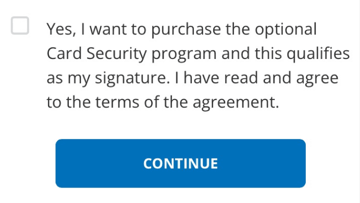
My goal was to design a page + enrollment interaction made it obvious Payment Security was a paid and optional feature.
It was hard to land on an interaction that was easy to understand and liked by product and design leadership.
Payment Security enrollment in the old application. To opt out, leave the checkbox unselected and click "Continue."
Option 1
Radio buttons make the decision a clear yes or no question
Looks very different from agreeing to T&Cs—something I believe the page can resemble because of the amount of legal text
Design leadership thought radio buttons looked outdated
Option 2
Leadership liked the checkbox interaction
Product didn't like the CTA defaulting to "continue without Payment Security"
Felt too similar to agreeing to T&Cs—an interaction I wanted to avoid
Option 3
An error message appears if the user clicks the CTA without checking the box
Product and design leadership liked this option the best
I didn't like advancing to the next page via a tertiary button. This was inconsistent with the rest of the application.
Part six
Usability testing
Customers understood the concept of Payment Security, but most needed more info before making a decision.
I worked with my content and legal partners to make a few content changes that helped define the cancellation process and what qualifies an "event."
“It’s not telling me what I have to do once I do get back on my feet. Also, is the debt fully cancelled, or is it just put off the books for a couple years? I have no idea, which is slightly concerning.”
– P1
“I’m wondering how they review what is a life event. Is it kind of like insurance where you submit a claim and they review it, and there’s a chance that they may not even take it? I’m wondering more about what the process is like.”
– P3
Part seven
MVP delivered
The application launched in app and on paypal.com in June 2022.
Part eight
Initial results
$500M
TPV in the first year
+8%
funnel rate vs. old card
922k
new accounts
+6%
conversion vs. old card
Part eight
Optimizations and experimentation
Streamlined the application for checkout
Adding an entry point in checkout met our target customers where they already were—online shopping with PayPal.
I wanted customers to have the quickest application experience possible so I removed the optional features (add authorized user, Payment Security, set card as preferred) because they can be configured in the app.
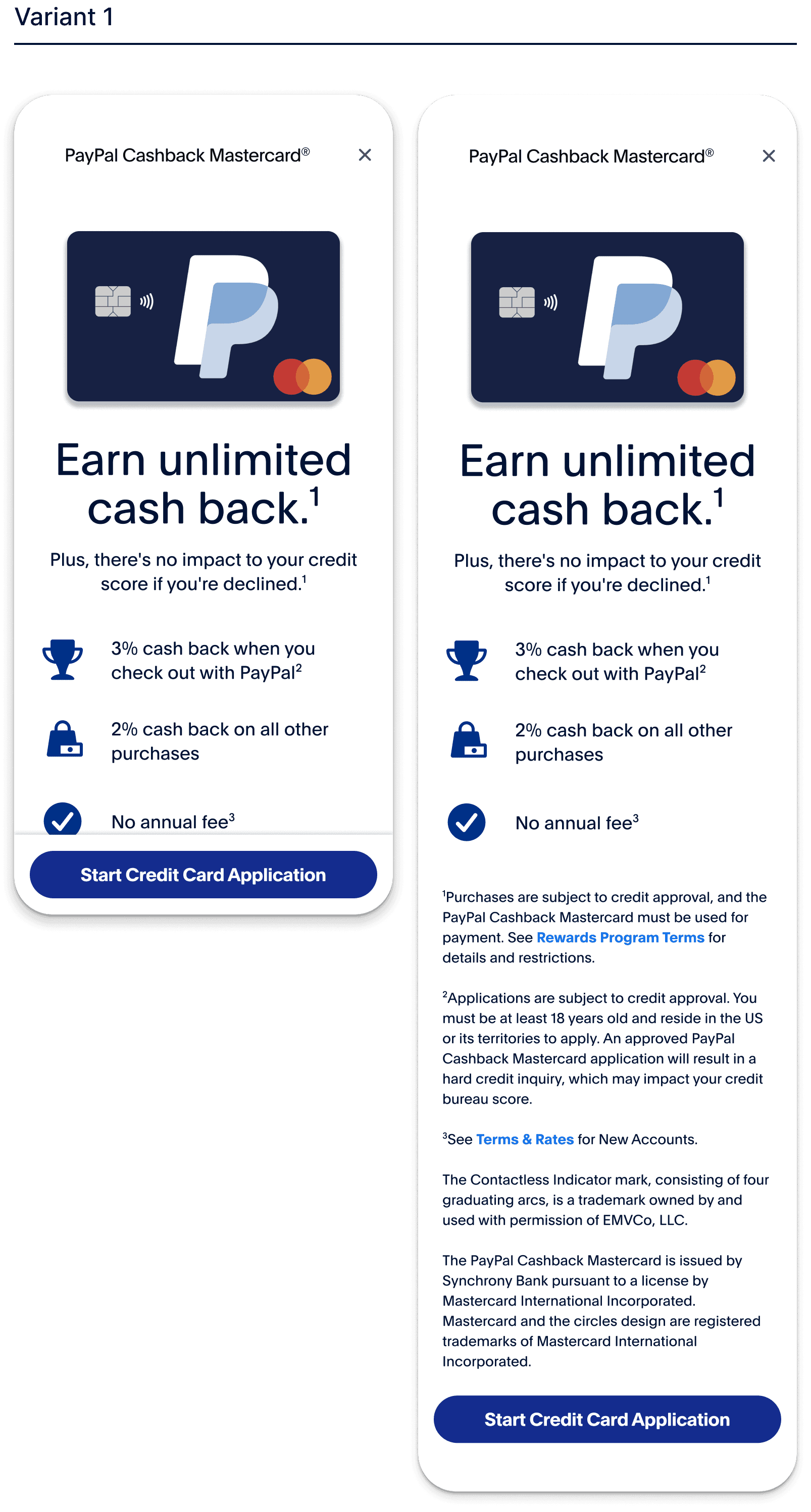
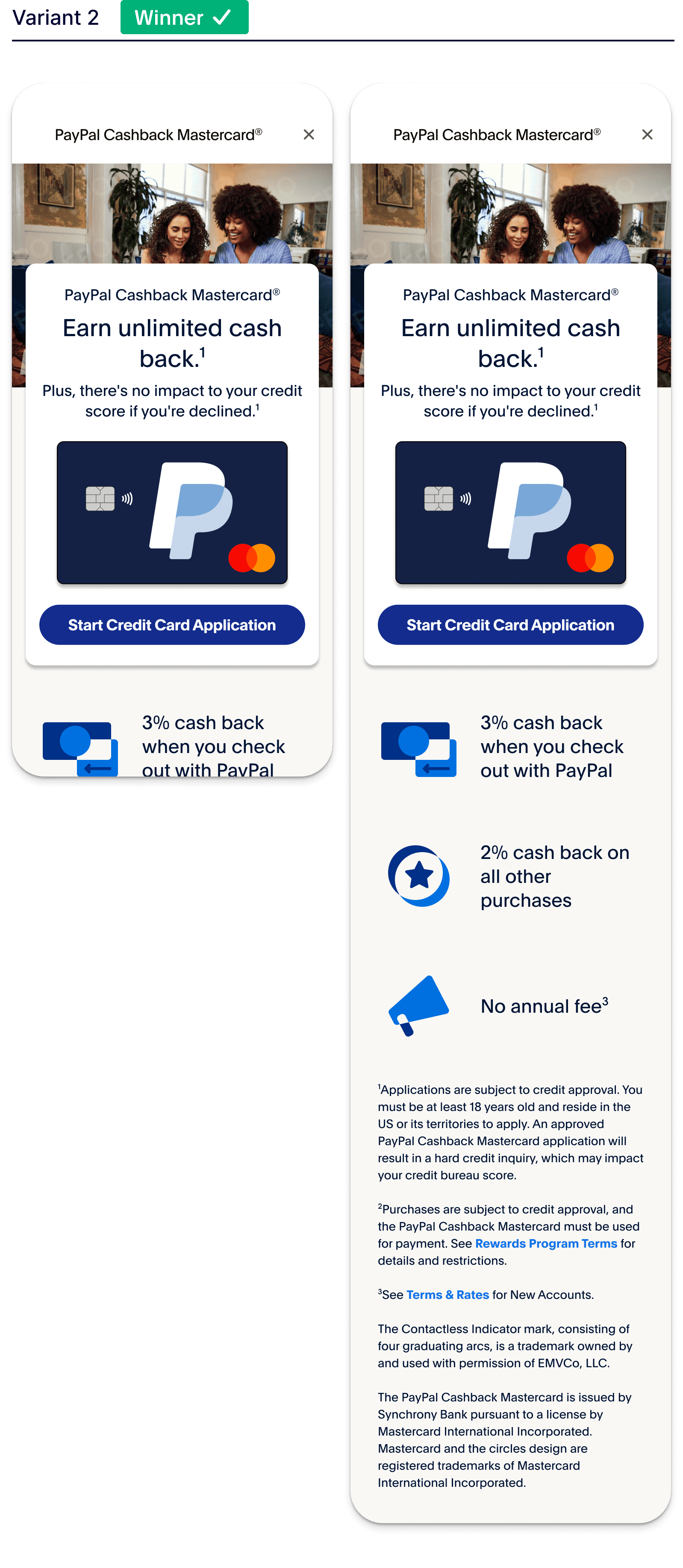
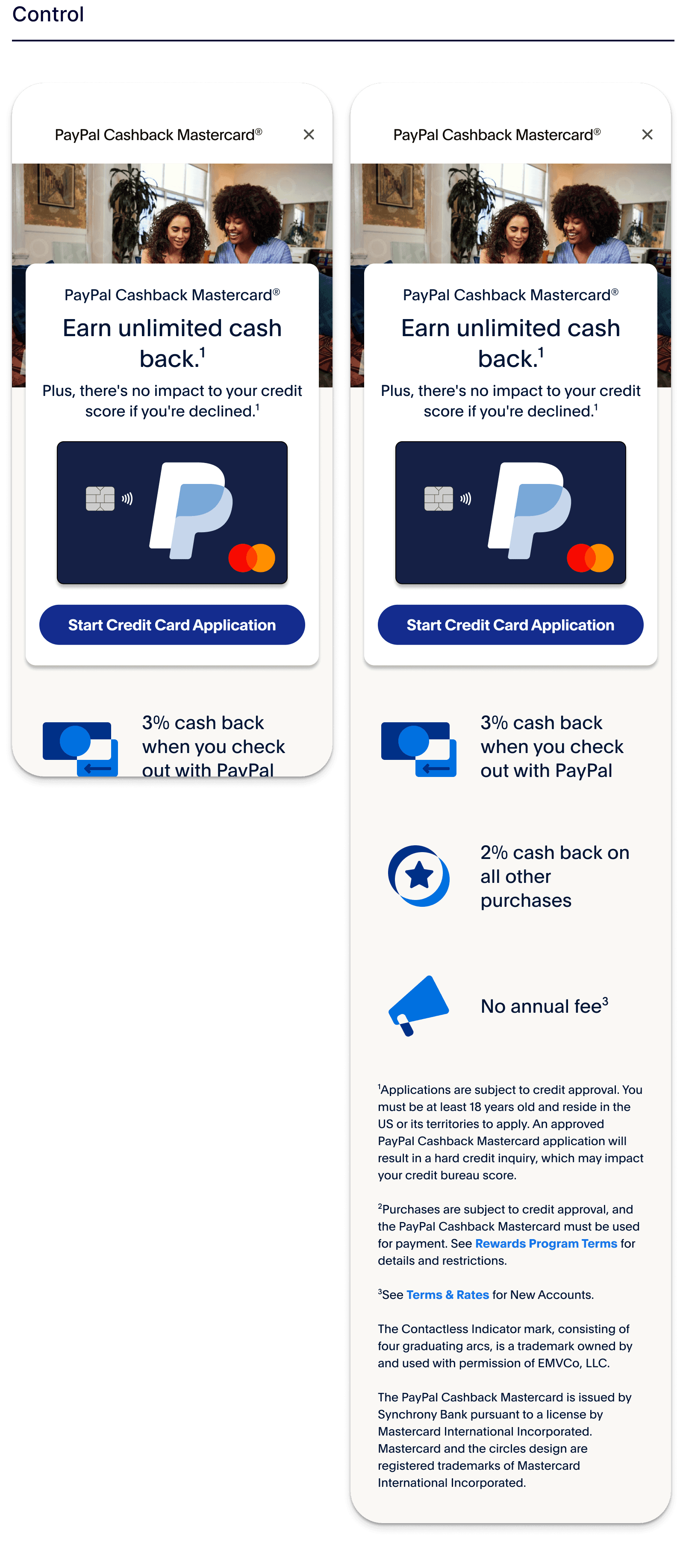
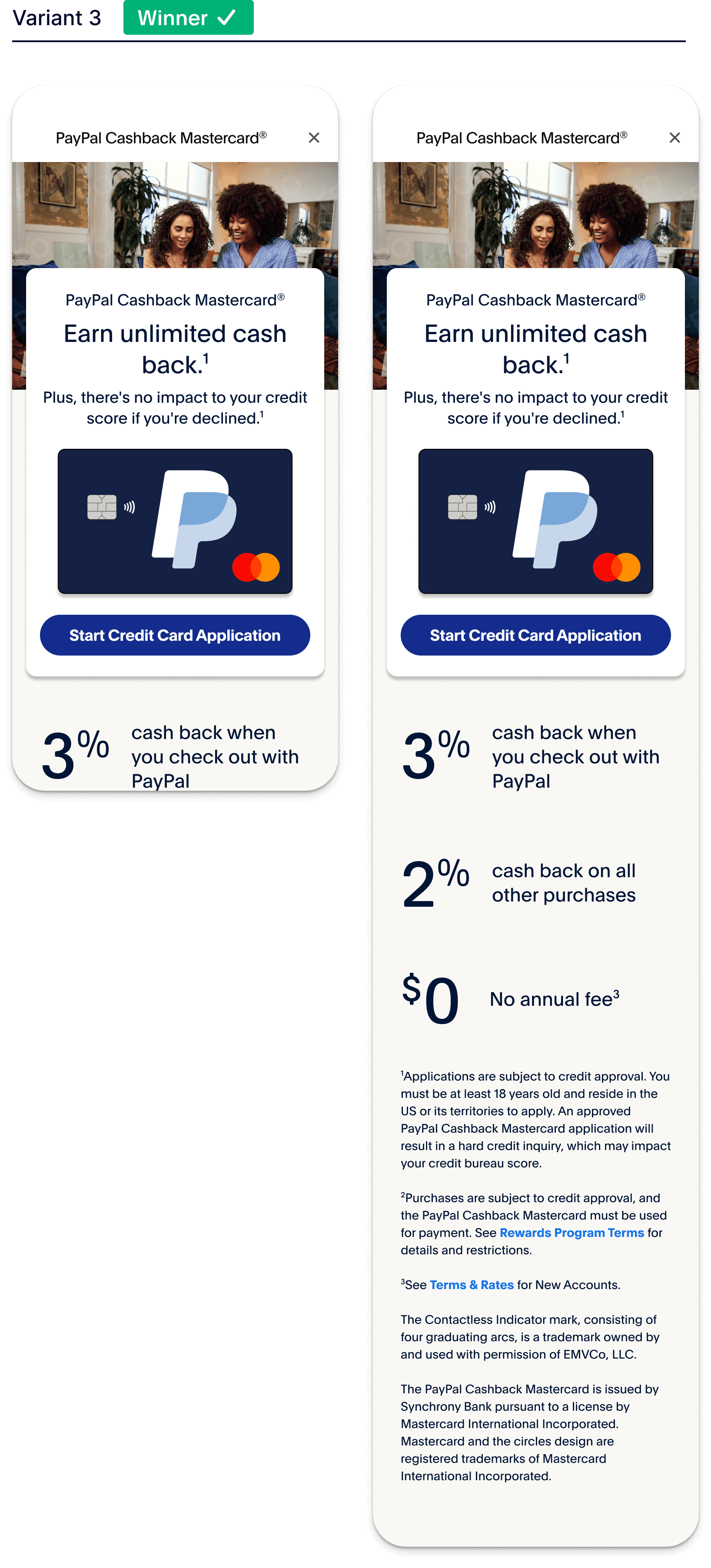
Landing page A/B tests increase app start and completion rates
Actions
Created new layouts of the landing page to A/B test in the live experience
Conducted rapid research testing with customers in a moderated setting
+5%
increase in app starts
+4%
increase in completion rate
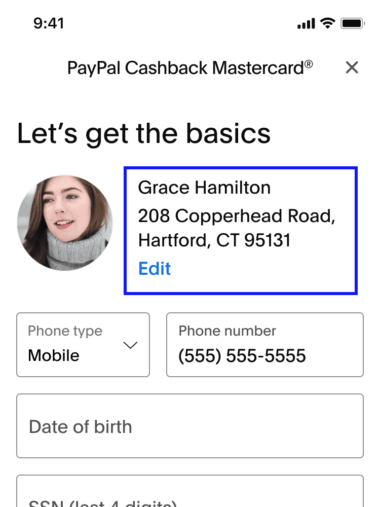
Improving billing address visibility led to decrease in customer calls
Problem
5% of Cashback Mastercard customers who called the support center reported never receiving their credit cards in the mail.
Hypothesis
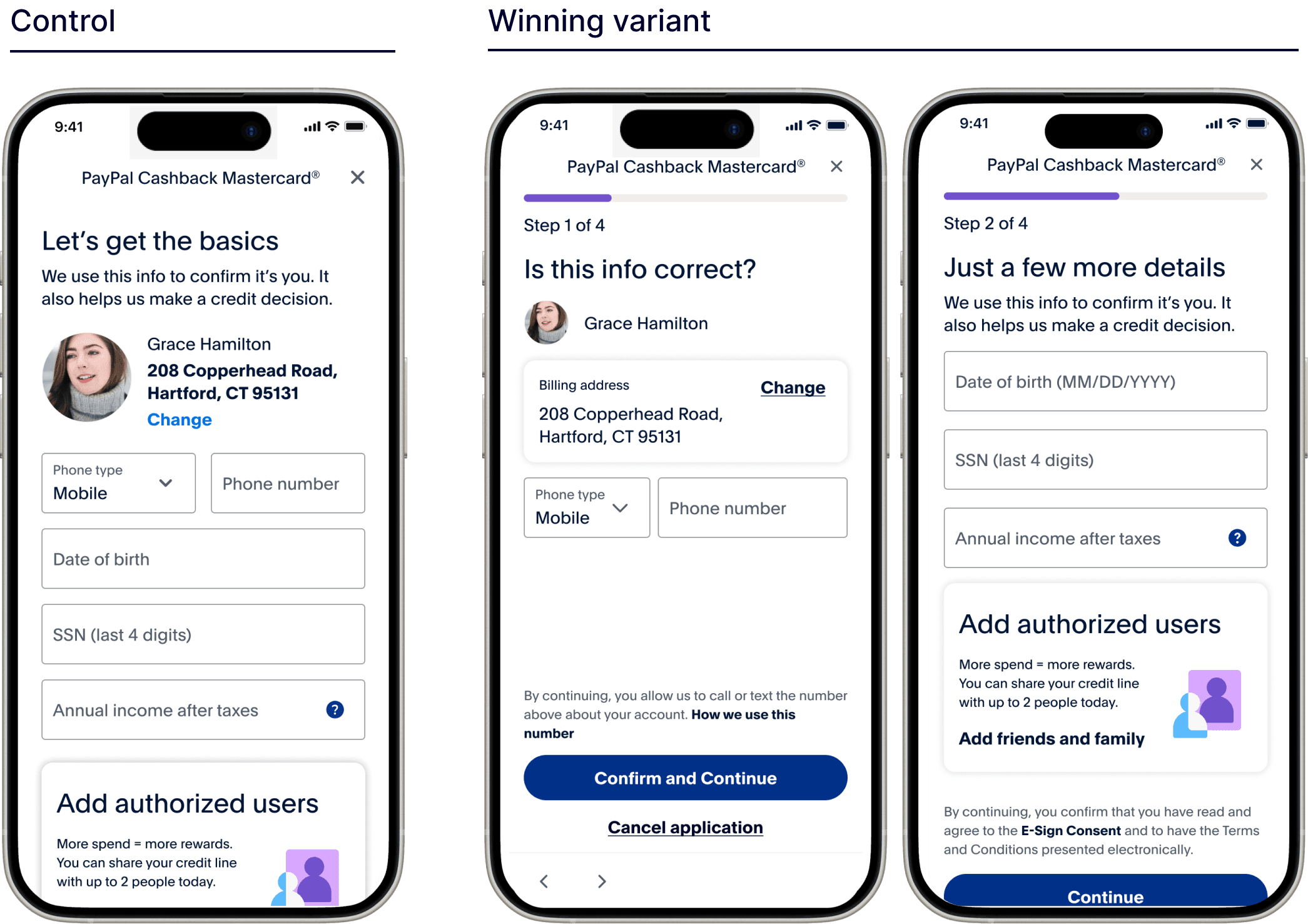
If I divide the application into two pages, then customers will notice the pre-filled billing address and have their card sent to the correct address.
Actions
Created new two variants to test vs. control
I wanted to test a progress bar so I created three additional variants: the control and the two variants with a progress bar
Results
80%
decrease in calls (from 5% to <1%)
2.5%
average decrease in drop-off per page
+6%
conversion vs. MVP
16k
new users vs. control
Part nine
Optimization results
$2B
increase in TPV vs. first year
+14%
increase in conversion
5%
decrease in drop-off per page
Part ten
UI alignment across flows
In the fall of 2023 all experimentation was paused and design leadership required all applications to have the same look and feel so I had to make some adjustments to the UI.
Part eleven
What I'd change
Push landing page visuals further
I wish I would've spent more time creating ideas that challenged the design system guidelines
Find another banking partner
Keep the phone number pre-filled
Removed per legal guideline, but the customer is already authenticated and a phone number is required to use PayPal
A/B test one question per flow
I backed down too quickly when I initially presented the idea to leadership.
